Category
Design, Our News
Date Posted
14th November, 2024
Hi! My name is Franki and I am the designer here at First Internet. I won’t lie, writing blogs is not my forte, being a designer, I primarily focus on just doing the graphics to go with the blogs. But as 2024 is now coming to an end, I wanted to look back at what trends 2024 has given us and maybe get an insight into what 2025 could have to offer. What better way to share all this knowledge than to write it down.
As we approach the end of 2024, the design landscape has once again evolved. Designers worldwide are pushing boundaries, combining innovation with artistry to create experiences that are more immersive, interactive, and personalised than ever before. From AI-powered creativity to Typography growth, this year’s trends reflect a diverse fusion of the past, present, and future.
Whether you’re a designer looking for fresh inspiration or a business eager to update your digital presence, these trends offer exciting insights into what’s driving the design world today.
Here are our favourite ten design trends that have shaped 2024, blending aesthetic innovation with enhanced user experiences:
It’s fair to say 2024 has been the pivot year for AI. ChatGPT has become a go-to tool for numerous people, whether seeking information, rephrasing content, or even writing an entire blog post (don’t worry, this one’s come from the heart). It’s almost like a search engine in its own right.
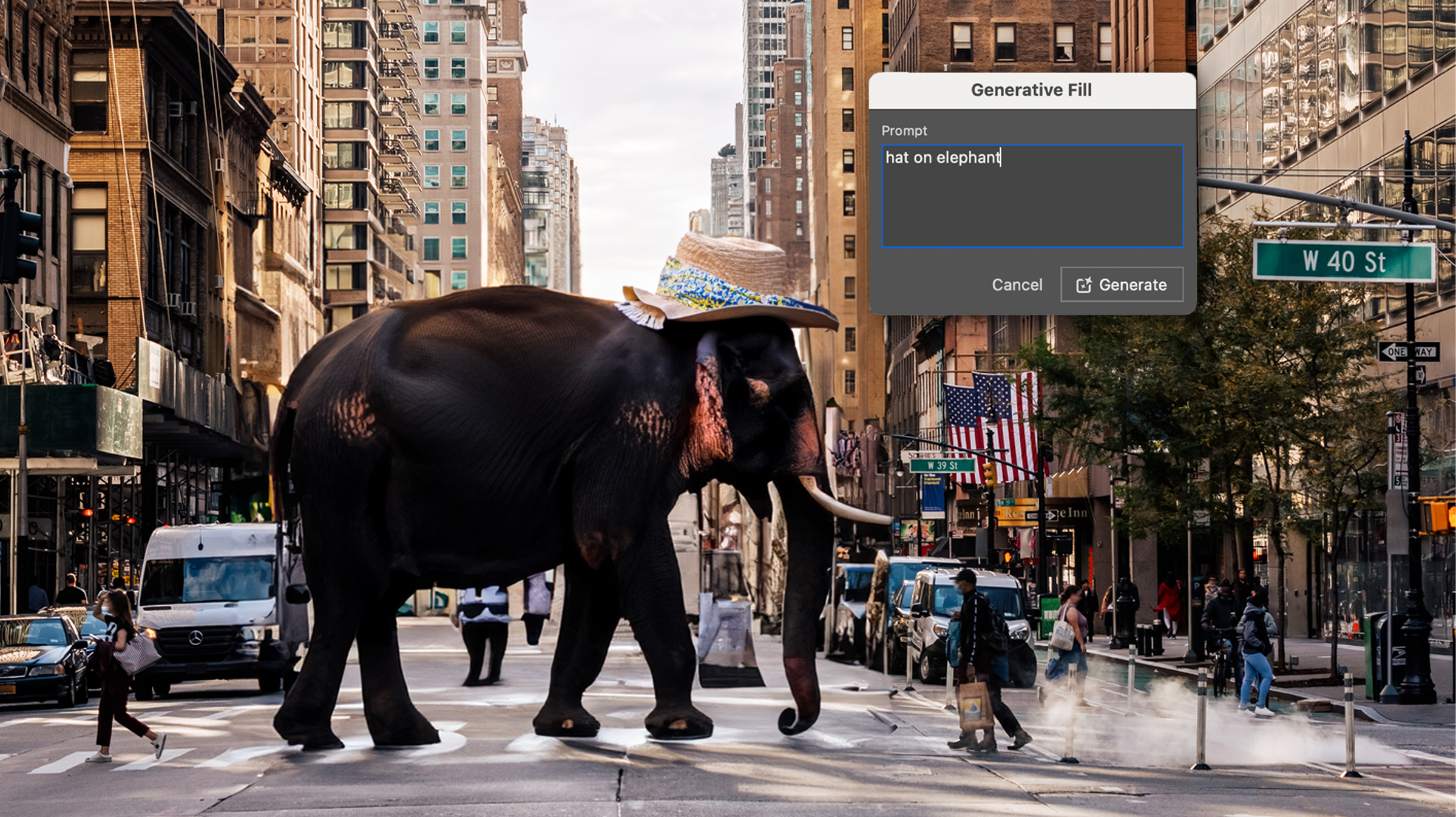
For designers, one of the biggest shifts has come with Photoshop’s Generative Fill feature. This tool has revolutionised creative possibilities, enabling users to elevate their designs or create surrealism-style art pieces and dream-like compositions with just a few keywords. It’s become the fastest and easiest way to transform and refine images right now. Whether it be a quick way to “remove background” or a fast way to “add an elephant with a hat on”, the opportunities are endless.
This trend includes raw and almost “brutal” elements like bold typography, sharp shapes, vibrant colours, and stark contrasts. Designing out of the typical “aesthetically pleasing” theme allows you to embrace imperfections, it brings a sense of authenticity and directness, often used in fashion and lifestyle websites. Although minimalism was the theme from 2023 and even still popular in 2024, it has become trendy to be bold and vibrant, free if you will.
Neo-brutalism allows you to be able to create a design which cannot be deemed as boring, it’s wild and creative, finally allowing designers to go wild with their creative flair but stay on trend. The future is bright.
A massive trend this year has been typography and having the freedom to allow you to go crazy with it! Kinetic Typography is essentially text that moves, morphs or animates. From simple scroll-triggered animations to more elaborate transitions, kinetic typography draws attention and allows designers to convey emotions and information dynamically.
A popular place to see Kinetic typography would be in short animations, whether that be a promo video with quick transitions or a short, snappy clip providing information in a sleek way. Kinetic typography is most often viewed as logos being animated at the start of promo videos; it allows text to be brought to life.
Whether it be the 70s or Y2K, these eras are nostalgic to viewers out there. These retro themes relate to your viewers, so depending on your target audience, they can be super effective.
With the 70s theme, you look for class and minimalism, using soft, faded shades on the colour wheel. Light browns, faded blues & reds. Illustrations were super popular back then. The 70s were the closing eras for minimal line drawings inspired by the likes of Andy Warhol, drawing the basics freehand. This trend is now coming back. It’s fun to look at and can sometimes be more effective than imagery. Look at the likes of Oatly Milk; their packaging is all hand-drawn illustrations… very 70s-themed with their faded colours.
Now, Y2K is a completely different kettle of fish; it’s not seen as unattractive as of yet. Instead, it’s what people now describe as vintage, retro, if you will. A lot of fast-growing brands are using the Y2K era to promote their new lines, knowing full well their target audience would’ve been teens around then, allowing them to feel the nostalgia. For example, Sisters & Seekers, an upcoming and fast-growing fashion brand for females, just released a line named “Cold Calling”. The whole photoshoot and graphics were vintage style based around Y2K.
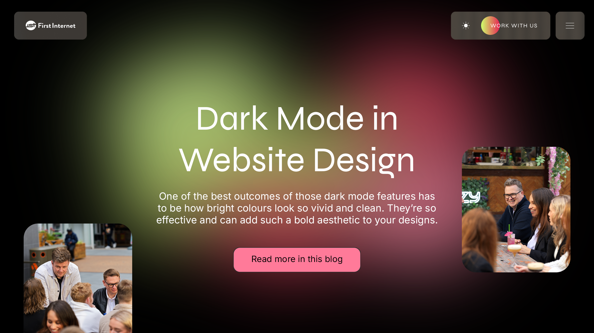
This has to be one of the biggest trends of 2024 in Website Design! It mainly started when mobile phones introduced dark themes; it’s different, so people love it. It’s more mysterious and softer on the eyes. Viewing websites with white space can be harsh on the eyes sometimes, viewing dark mode just allows that sense of softness for people viewing. It helps with eye strain.
One of the best outcomes of those dark mode features has to be how bright colours look so vivid and clean. They’re so effective and can add such a bold aesthetic to your designs. Gradients, especially, show that contrast which modernises all of those gloomy features.
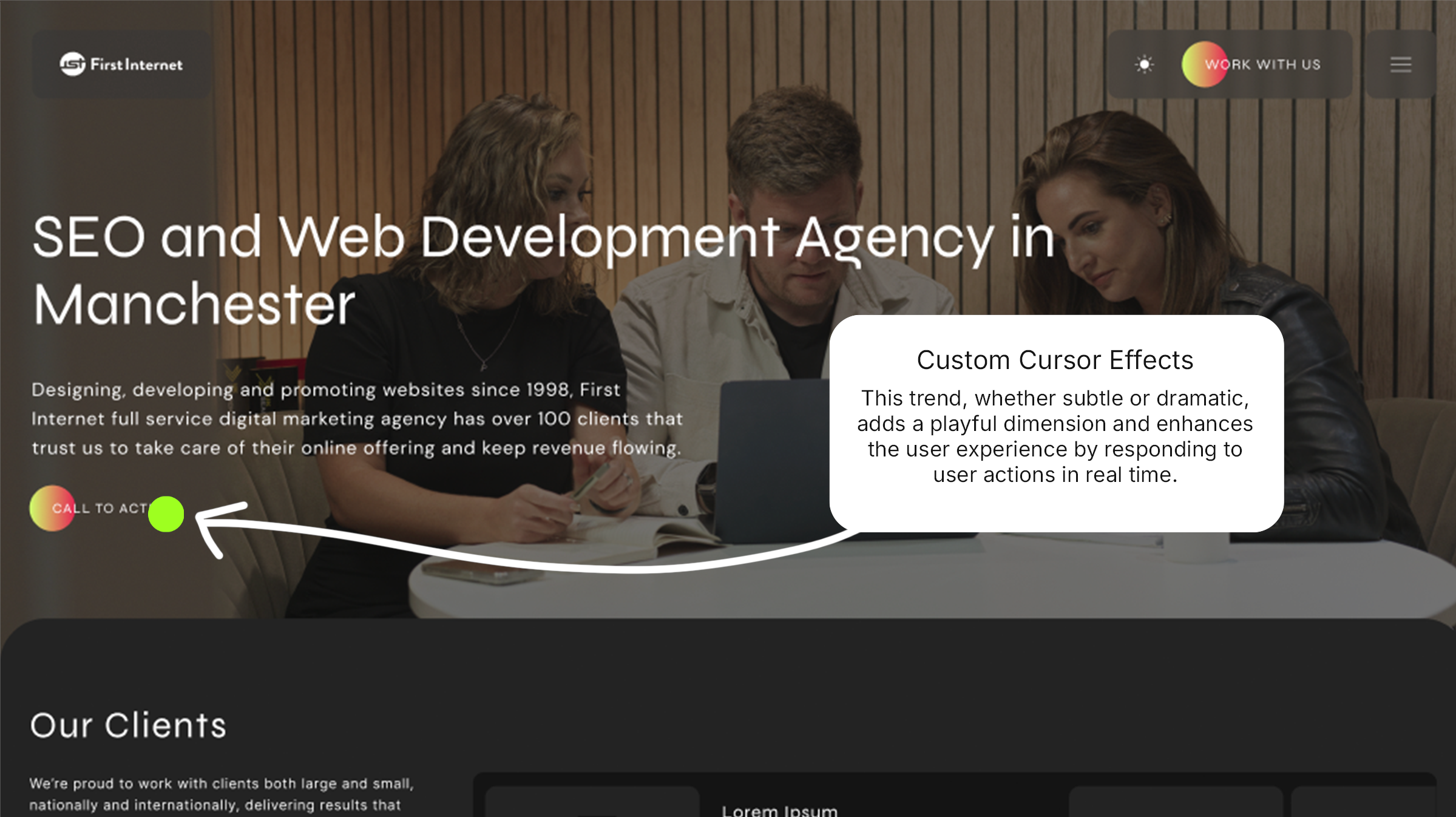
Interactive cursors that change shape, size, or colour when hovering over elements are making web interactions more engaging. This trend, whether subtle or dramatic, adds a playful dimension and enhances the user experience by responding to user actions in real time.
When viewing old websites, you often just see the standard cursor, which has been the same for decades. A way to revolutionise your website would be to change that cursor, play outside the box and show that creativity. It’s more enjoyable for the user if they get to follow around this coloured circle, it’s something different and it quite frankly just fun. Not only that, but it’s another way to bring that primary brand colour into the website.
Rooted in the charm of early internet design, this vintage-inspired trend revives pixel art, grainy textures, and classic iconography from the Web 1.0 era. Designers are bringing back chunky fonts, vibrant colour blocks, and clunky animations to create a sense of retro authenticity.
The style captures the playful, DIY spirit of early online spaces, giving audiences a mix of warmth and digital nostalgia. By blending this throwback aesthetic with modern layouts and functionality, it provides a unique contrast—quirky yet polished, familiar yet fresh. It’s a visually playful approach that celebrates the roots of digital design. Vintage is in.
Experimental typography in 2024 is all about pushing the boundaries of traditional type design. This trend embraces distorted letterforms, overlapping text, unexpected spacing, and bold, unconventional placements that challenge readability to create a visual impact. Designers use exaggerated scaling, kinetic motion, and unexpected textures, turning type into dynamic, artistic elements rather than simple text. Each piece of typography feels like a unique visual composition, adding personality and depth to designs. This trend captures attention, makes statements, and invites viewers to engage with the text in entirely new ways, transforming letters into a powerful visual language.
Balloon typeface is one of the experimental typefaces which has massively grown this year. One brand that pushed this is TreatStudios, a jewellery brand whose branding comes across as fun, bold and different from the rest. This specific typeface moves forward into the future and reflects their products well. They are commonly known for their bubble letter charms for necklaces, so to be able to demonstrate such a theme, not only through their product but also as their typeface, really just unites their brand as a whole.
Abstract gradients are taking centre stage, especially in dark-mode designs. These gradients feature-rich, moody hues that smoothly blend into each other, creating depth and movement across dark backgrounds. Designers are experimenting with fluid, organic shapes and multidimensional colour transitions, often adding subtle glows or soft blurs to create a sense of light emanating from within the screen.
This style offers a dreamlike, almost surreal quality that feels both modern and atmospheric. Abstract gradients not only add visual interest but also soften the starkness of dark mode, making interfaces feel more immersive and sophisticated. One way in which brands are developing on this is when they include their primary and secondary colours, instead of having a standard hero banner with an image to sum up the brand, they’re modernising the feel before the fold with a moving gradient, introducing you to the brand straight away.
Interactive design and animations are redefining user engagement by making every click, scroll, and hover feel intentional and alive. This trend leans heavily into micro-interactions, with animations that respond instantly to user actions, guiding them seamlessly through digital experiences. One brand demonstrating this trend is Stripe, as you scroll through a website with information, you’re introduced to animations triggered by scrolls; it just makes that user experience that little bit more memorable.
Subtle movement, like button ripples and loading animations, enhances the user experience while adding personality. More transitional animations, like parallax effects and smooth transitions between pages, create a dynamic flow, drawing users deeper into the content. Interactive design now goes beyond aesthetics, making each interaction meaningful and engaging, turning even the smallest motions into impactful storytelling moments. Some great resources are out there to push on these themes, Lottie being a popular one, moving your After Effects animations into ones that can be controlled once activated onto a website when integrated into code.
Each of these trends reflects the evolving intersection of creativity, technology, and user experience that defined 2024’s design landscape. Whether you’re looking to modernise your website or experiment with new graphic styles, these trends offer a diverse palette to explore.
With 2025 quickly approaching, it’s good to predict what the future of design could behold. I’d say in 2025, graphic and website design trends are expected to embrace vibrant interactivity, sophisticated AI integration, and a touch of nostalgic futurism. Websites will likely become more dynamic, with personalised AI-driven layouts that adapt to individual user preferences and behaviours, enhancing both user experience and engagement. Bold, immersive 3D visuals and animations will continue to gain traction. Dark mode and muted colour palettes are anticipated to make way for brighter, high-contrast colours, while typography will also grow bolder, focusing on expressive, large typefaces that stand out across devices. I believe 2025 will be all about growth and enhancements on the trends we’ve seen come around this year.
Looking to give your brand or website a modern update but not sure where to begin? Reach out to us today, and let’s get started on that journey together.
Design, Our News
14th November, 2024
Call us on: +44 (0) 161 941 5330 or email us: info@firstinternet.co.uk
Get in touch today!