Our News
Getting faster results from your SEO project
In most cases, there are some techniques to bring in results faster than you’d be comfortable promising to a client.
20th November, 2024
Wayne Seddon, Designer
The finished product may look great but if nothing fits, it’s going to look stupid!
There are many articles debating which is more important, your website’s content or the design of your website. The truth is, they’re both equally important and neither one would work well without the other. Your website could have excellent copy which is really engaging and informative, but if it’s laid out badly and your website looks dull and boring, who’s going to stick around and read it? Equally, if your website looks the bee’s knees with eye-catching imagery, an attractive colour palette and a cool logo, but doesn’t have any substance behind it, then users will leave your website disappointed and probably won’t come back.
So how do we strike the right balance?
Any good website should start with plenty of planning. Begin with the skeleton of the site – a sitemap – What pages do you need? What subpages (if any) do you need? What order should they be in? Once you’ve built the skeleton start thinking about the heart and life-blood of the site – the content (text and imagery) for each page. You may find that some pages have very little content and may not warrant a full page to itself, or vice versa. A page may have lots of content and need to be broken up into sections. Once you’ve written the content, the sitemap might need amending. You might need an outside perspective to help you with this if you get stuck and this something we’ve helped a number of our clients with.
Here’s where your designer steps in.
OK so you’ve got the skeleton, and a beating heart pumping rich content through the veins of your site. Now you need to add some skin and dress it up so it’s appealing enough for your customers to read. This is the job of the designer, it’s their job to make your content stand out, look organised, professional and trustworthy.
Standing out: Make sure the designer knows what your key messages and core values are. These can be expressed by stunning imagery or pieces of typography art that can be used on your homepage to catch the user’s attention.
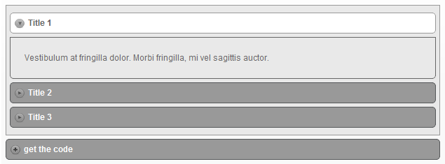
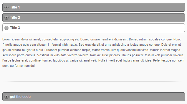
Layout and organisation: The designer will read through all your text and decide the best way to lay it out. There are a multitude of options and techniques. The basic ones include multiple columns – splitting the copy up into manageable bite size chunks, either in halves, thirds, quarters, or maybe even fifths or sixths. Introducing drop caps, block quotes, highlights, icons and info boxes are other simple ways to make your text easier to read. Interactive functions can also be used so the visitor has more control over what information they see. Such functions include Tabs, Accordions and Toggles. These are very useful when a page has a lot of information that may be overwhelming for the user.
Tabs
Take a look at HJ Slate’s About Us page to see it in use.
 Accordions

Toggles
Discreet Investigations Services page is a good example of how toggles can be used.
These functions usually negate the need for subpages.

Professional and Trustworthy: All of the above techniques should be used wisely and only where necessary. Being sensible about what techniques to use and when to use them will be the deciding factor to whether or not your website looks professional. If your website looks professional then this will bestow a sense of trust within the user and keep them coming back to your website.
The Alternative
When a designer doesn’t have content to work with, they’re forced to use Lorum Ipsum (dummy text) and stock imagery (covered in watermarks). This method is fine in the short-term if you need 2 or 3 draft designs creating quickly, but it often leads to a lot of later changes to the design once the content has been added. It’s usually quicker in the long term to plan and write the content beforehand.
Our News
15th February, 2012
Call us on: +44 (0) 161 941 5330 or email us: info@firstinternet.co.uk
Get in touch today!